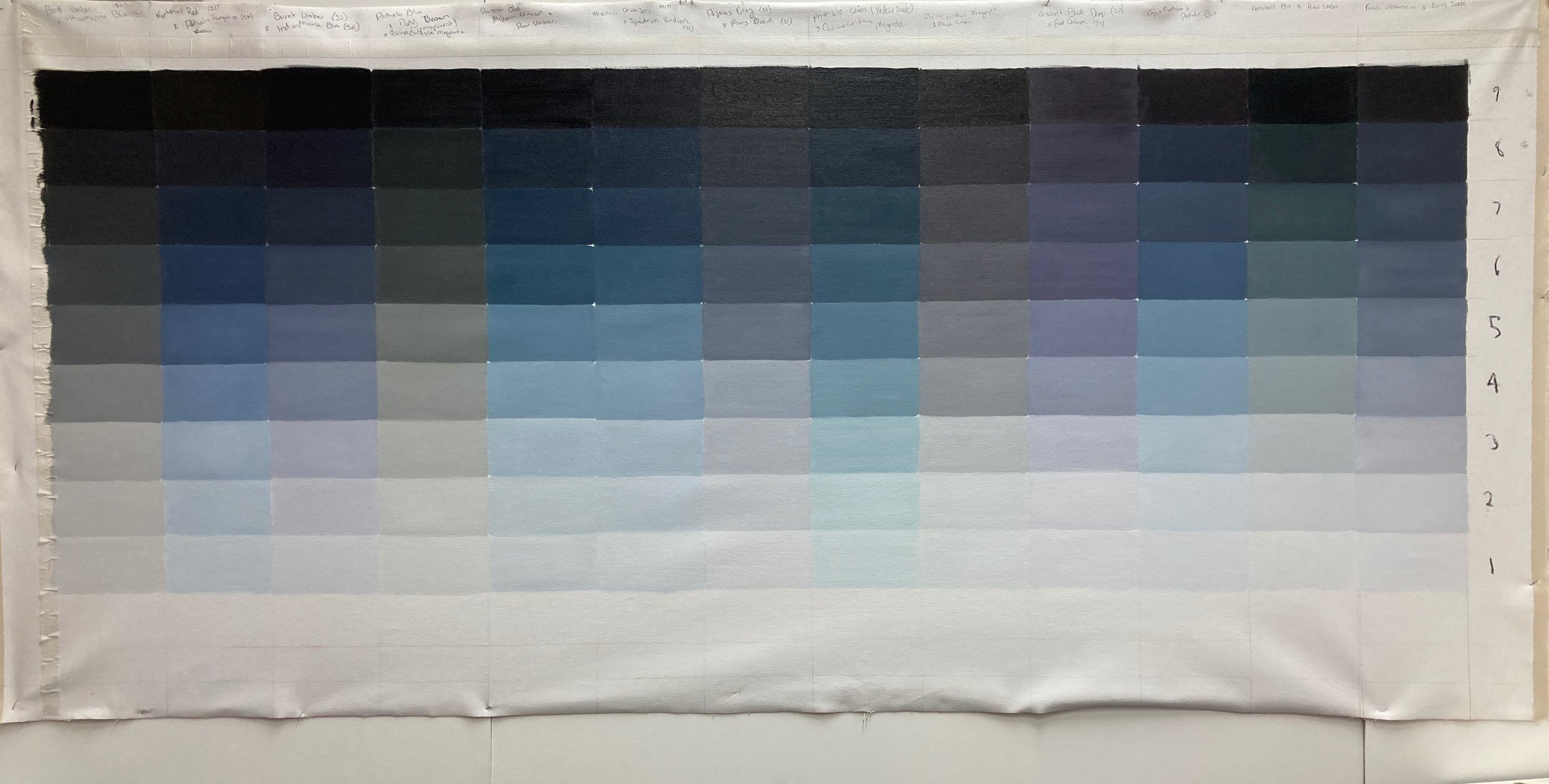
Row 1. Burnt Umber & Ultramarine Blue
Row 2. Naphthol Red & Phthalo Turquoise
Row 3. Burnet Umber & Inanthrone Blue
Row 4. Phthalo Blue, Dutch Brown (transparent) & Quinacridone Magenta
Row 5. Prussian Blue, Alizarin Crimson & Raw Umber
Row 6. Alizarin Crimson & Spectrum Veridian
Row 7. Paynes Grey & Mars Brown
Row 8. Phthalo Green (yellow shade) & Quinacridone Magenta
Row 9. Quinacridone Magenta & Olive Green
Row 10. Cobalt Blue Deep & Red Ochre
Row 11. Caput Mortuum & Phthalo Blue
Row 12. Permanent Blue & Raw Umber
Row 13. French Ultramarine & Burnet Sienna
James Fox in The World According to Colour (2021), in his discussion about the cultural demonisation of black as a hue or absence of colour cornicles the polarising attitudes and mythology of black over the centuries. To contrast the Wests ‘fear of the dark’ he quotes Jun’ichirō Tanizaki’ essay In Praise of Shadows (1933) auguring that “the ‘magic’ of darkness was integral to eastern aesthetics – and completely at odds with the misguided western obsession with light:
We Orientals tend to seek our satisfactions in whatever surroundings we happen to find ourselves, to content ourselves with things as they are; and so darkness causes us no discontent, we resign ourselves to it as inevitable. If light is scarce; we will immerse ourselves in the darkness and there discover its own particular beauty. But the progressive Westerner is determined always to better his lot. From candle to oil lamp, oil lamp to gas light, gaslight to electric light – his quest for a bright light never ceases, he spares no pains to eradicate even the minutest shadow.
To paint a deep dark or black can be problematic. I have found the black oil paints within my possession can be quite harsh and flat. Sitting spatially on the surface and quite flat. This is fine when the work is more graphic in nature, but to render a deep depthless black is not formulaic
Black line and tonal shifts are elementary to any drawing, and no one masters it more than the Chinese’s and Japanese ink masters. Fox in discussing describes Sesshū’s Splashed -Ink Landscape(1495) as “among other things, an exercise in the generative capacity of black. There are light blacks and dark blacks, warm blacks and cool blacks, wet blacks and dry blacks, thick blacks and thin blacks, bleeding blacks and blotted blacks. Some stab, some cares, and others are so pale that they appear almost white. This painting proves that there is nothing monotonous about black. It is no less beautiful, and no less varied than any other colour. The greatest virtue of a monochrome painting, like darkness, is that it demands imagination; it allows its viewers to fill the gaps. Austerity need not mean dullness. In the minds eye, Sesshūs chameleonic blacks can become any colour in the spectrum, in ever-changing combinations. But if he had used coloured paint, they could only have been hues he chose.
The third week into this residency and I have finally finished my first painting in the Mock Black series. This series grew organically from my ChromaCorona series. Whenever I discovered a new black, one made by mixing two coloured hues I would make a note of the recipe and on a scrap piece of canvas do tonal graduation from light to dark. This scrap canvas grew slowly over the last two years, the first section I tested with simply the black pigments I owned. Mock Black, Transparent Black, Ivory Black, Cold Black and Lamp Black. Then from that point of departure continued the chart when new blacks were discovered. This strip of canvas has sat in the corner of my studio for a few years now, but increasingly I have been drawn to the beauty of it and surprised at the tonal nuances pending on the original pigments in the mix. It wasn’t until preparing for the residency I thought I should enlarge this tonal swatch and begin to seriously critique what I am seeing.
Perhaps it has been a reaction to the intensive saturated colour charts I have been doing, but I have found it so refreshing not to think about colour for a season. I also have been thinking about the subjective nature of colour and how every individuals’ eyes all read colours slightly different. When I say think of the colour red, everyone in the room will think a slightly different red. This is the same for B&W, it is human nature to define by opposites and polarise positions, yet in reality there is no them and us, it is nuanced and full of unique understandings. Holding and appreciating these tensions, then similarities and differences has great value. With the back drop of Russia’s invasion of Ukraine, Floods throughout the east coast of Australia, Vac’s and Anti Vac’s and our political polarisation where politics no longer looks at negotiation and compromise for common good, but celebrities and ideology, I think slow methodical celebration of nuance and subtly of Mock Black is counter cultural and a perfectly fitting reaction to this cultural moment. Perhaps it is time we stop being afraid of the dark, and grow in appreciation of how shifting our perspective enables us to see what we previously were unaware existed, unlocking a whole new world of beauty and common humanity.
Fox, J, The World According to Colour, A Cultural History, (Allen Lane, Penguin Random House 2021 ), p 41
Tanizaki, J., In Praise of Shadows, trans. T. Harper and E. Seidensticker ( Stony Creek: Leete’e Island Books, 1977), p 31

